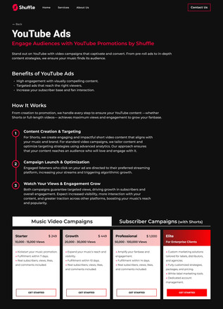
"Shuffle" approached me after a successful project we worked on together in the past, requesting that I create their company’s corporate website. Shuffle is dedicated to promoting artists through innovative digital strategies.
I designed two versions of the site with similar branding: one in Hebrew for the local audience, and one in English with content tailored to an international audience.

Problem
-
Brand Inconsistency - Shuffle lacked a clear branding language and were concerned about the inconsistent colors in their logo. They requested a design that conveys "luxury, boutique, grunge, and fresh"
-
Outdated Website - The previous single-page website failed to capture attention in the competitive music industry and lacked essential content pages
-
Diverse Audiences - To cater to their distinct needs, we strategically divided the website into separate platforms for Israeli and international audiences
Objectives & Goals
Corporate Website
A site designed to convey the company’s values and focus on contact. It will feature a homepage and three content pages: About Us, Campaigns, and Podcasts.
Consistency
Achieve a cohesive design throughout the website by standardizing color schemes, typography, and layout
KPIs
Contact Inquirie
Boost contact form submissions by 25% in the first three months after launch.
User Engagement
Lower bounce rate by 30% with better page structure and separate designs for different audiences.
Brand Consistency
Ensure the website maintains a cohesive look and feel, with all design elements matching the company’s updated branding vision.
Target Audience
The target audience is based on discussions with the company's managers, who identified their clients as Israeli musicians.
Conclusions -
-
Musicians at various career stages, from emerging talents to established stars
-
All music genres and languages
-
Individuals with the financial capability to invest in promoting their music - Shuffle is a premium company that works with top-tier artists
UX Writing
Tone of Voice
.jpg)
Accessible yet prestigious
Gender-neutral
Clear & Informative
One of a kind
Positive & Uplifting
Competitive Analysis
I identified three key competitors and requested feedback from three product designers on each site, both positive and negative, without revealing the purpose of the request. I then compiled the key findings in order to draw conclusions for my design.


Key Findings
-
Overload - Across all the websites, there is an overwhelming amount of text, with too much content and too little visual engagement to captivate the viewer.
-
Mismatch - The "Digistage" website is entirely in English, despite targeting an Israeli audience.
-
Outdated Design - Music is an ever-evolving industry, and websites should keep up with fresh designs and showcase expertise. Some sites feel outdated, with color schemes that fail to capture the energy of music or live performances.
-
Disorganized Layout - The content is scattered across too many pages, lacking focus. Users struggle to know what to prioritize and what value they gain from reading.
Information Architecture
.png)

Design Solutions
1. Enhanced User Engagement -
The original Shuffle website had too much information, leading to long scrolling. To address this, I implemented an interactive design solution that boosts engagement by allowing users to navigate through categories and access relevant sections effortlessly


2. Utilizing Visual Animations for Clarity -
I incorporated visual animations to streamline textual content and create digestible sections. This made the design more dynamic and improved content flow


English Website

Design System
The chosen color palette for the logo and visual identity includes red-pink and black. The red-pink evoke feelings related to music, performances, uniqueness, and standing out. The black complements this, creating a black-and-white atmosphere that adds an exclusive, boutique feel.
.jpg)

Mobile Responsivity
.png)


.jpg)
.jpg)
.jpg)